I’ve been wanting to design Skymagi’s UI for over a year, but programming gameplay always took priority. With sigils in good initial standing, I think it’s finally time for a new coat of paint.
I debated building a full resolution UI for Skymagi. UIs need to scale to many monitors, and size of components matters quite a bit. UIs also need to be clear and readable.
But, I just love the pixel art aesthetic. And 540p is still a good amount of detail to work with.
I told myself I’d try both, but I was halfway finished with pixel art and decided not to even start the other prototype.
The UI certainly could use more fantasy style and theming, but my initial goal was usable and readable.
Mage Unit Frames
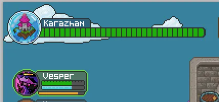
I started with the unit frames.
I used the brown from the original UI, but eventually moved away from it. Gray is much less in-your-face and lets the UI fade to the background.


I also chose Green/Orange/Red for health indicators. I might swap green for a darker blue to avoid R/G colorblindness, but I wasn’t happy with my blue versions.
I added the Select state and sigils icons (Evocation, Abjuration, Teleportation shown here) next to the casting bars.
The portraits are pixelated versions of my sister’s portrait art. They need touch-ups, but overall looked better than I expected with a simple downscale.

Castle Status
I had the idea to show a marble of the castle near the health with clouds coming off of it.
Since I already intend to create miniatures for each castle, it adds a nice detail to distinguish yours and enemies.
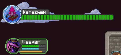
And to avoid blinding players during the evening, I mocked up a nighttime version.
In-game gold was minted by the Mages Guild before it collapsed, so I wanted to give it some character. We even considered calling it Trinkets or Baubles to better embody corvid society.
![]()
There’s not a lot you can do with so few pixels, but I loved the Eye variation, like the Mages Guild is always watching.
I also mocked up mana gems, the reagent needed for Mass Teleport. I ended up making them purple to match Teleport colors.

Wards
Wards are the actual reason I started down this path. The approach is pretty similar, but much more compact and easy to read.

I also did other elemental variations. Using similar logic with the teleportation sigil, I chose to swap the arcane ward to blue to match the abjuration sigil colors.
Mage Portraits
I drew a mock-up over a year ago. Let’s turn it into a reality!
I pulled inspiration from MOBAs (like Heroes of the Storm, an underrated game) for the spellcasting layout. The selected unit shows more detail for health and their prepared spells.
I don’t love it, but it’s practical. I added the mage name, inventory slots, spellbook, and stats.

Mana Leyline System
I haven’t discussed the mana system for castles much in the devblog, but the broad strokes:
- Your castle has limited mana for its sigils.
- Sigils need mana allocated to them to enable certain levels of spells.
- Sigils can be damaged, and then cannot be completely infused with mana until repaired.
It has inspiration from FTL’s react/energy system, but given the RPG-oriented nature of mages, I want sigils to empower mages and add more sigil slots rather than enable full functionality.
And I want it to have more of a mystical feeling to it, where there are actual leylines linking these sigils, and they can affect each other. Mana is more alive than energy. Perhaps it can overload temporarily (with damage after returning).
Courtesy of a friend of mine who had good mechanics suggestions.
So I decided to mock up sigils being linked in a graph. Right now they are connected by lines, but in the future I envision mechanics where leyline structure influences how mana flows across sigils.

I added damage and infusion to the nodes and ended up with something I’m fairly happy with. I reused the mana gem to show total capacity on the nodes for now.
Imagine a layout where the mana font of the castle spreads from top-to-bottom, and broken sigils do worse than disable those sigils, they might stop the flow across all the leylines!
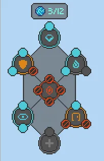
Hm, unified colors for sigils looks good here. Maybe I need to bring that into the game objects to show health status…
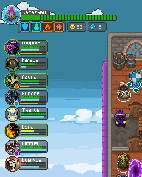
Enemy Castles
Unfortunately, I don’t have screen real-estate to show the full mana leylines of an enemy castle. I created an abridged status.
And while the castle status indicator worked for enemies, it doesn’t convey the hostile nature it should.

So… I made it red!

All together now!
I think the pixel aesthetic worked wonders here. It is a simple gray and transparent look, but it gets out of the way and keeps information density fairly high.
I don’t think this will be what we launch with, but I’m happy with it.
![]()